If you have questions about the
SNP CI / CD, or if you require logos
/ lettering, please contact us:
design@snpgroup.com
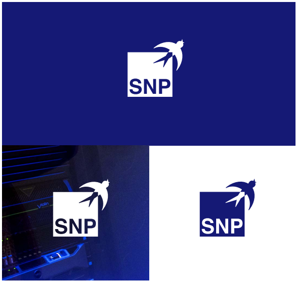
The logo
Basic version
The basic version of our logo is white lettering on a blue square.
The logo is available as a negative version for various purposes.
Further information is available on the following pages.
Logo variants
As flexible as the solutions we design for our customers:
To showcase our logo on all communication channels, our revised
logo is available as both a positive and a negative variant. Use the
negative variant when placing the logo on any dark background.
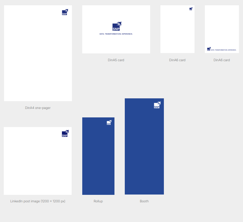
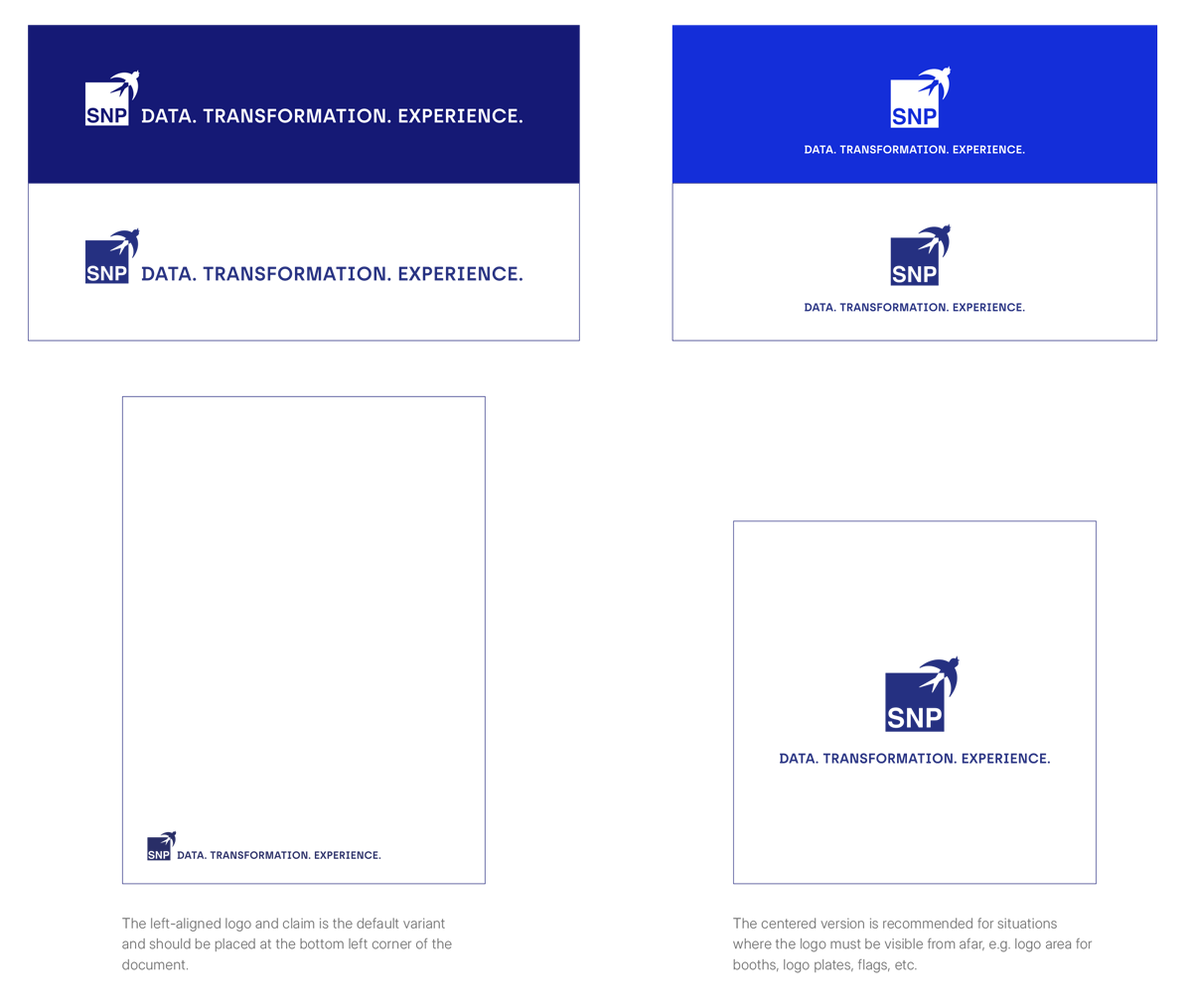
Logo sizes
The logo size is determined by the distance between the logo and the page margin. The square of the logo should be exactly the same size as the white square at the top right. For standard formats, the size specifications are listed below.
If the logo is used with the left-aligned claim, place it exclusively at the bottom left. If the logo is used without the claim, you can also place it at the top right.
The logo must not be used in images that do not originate from SNP, e.g. in collaborations with customers or partners, or self-produced images for social media.
Minimum sizes according to file formats
| A4 cover: | 15,856 x 16,19 mm | |
| A4 one-pager: | 19,019 x 19,425 mm | |
| A5 cards: | Logo + claim: | 104 x 41,473 mm |
| A6 cards: | Logo + claim: | 90 x 11,499 mm |
| Logo: | 9,508 x 9,711 mm | |
| Rollups: | 126,85 x 129,522 mm | |
| Booths: | 167,194 x 170,715 mm | |
| LinkedIn posts: | 123,401 x 126 px |
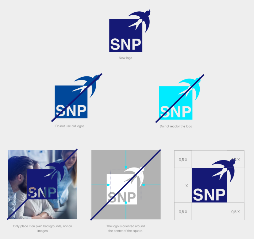
Logo do's & dont's
There is no game without rules: To ensure that our look has the same impact worldwide, do not color our logo in and only place it on plain backgrounds. In addition, use of the old logo or old colors is not allowed.
Important
The logo is oriented around the center of the square.
Free space
The free space around the logo is a firmly defined zone that must
remain unchanged under all circumstances. Do not allow any other
element to enter this zone.
Claim
Our claim consists of catchy words that reflect us as a company. The claim is used in various situations and must be applied appropriately to each situation. Accordingly, the different application possibilities are visible here.
RGB: 21 25 117
CMYK: 100 90 0 10
Pantone: 2118 C
RAL: 5002 Ultramarinblau
RGB: 20 46 217
CMYK: 93 76 0 0
Pantone: 3506 C
RAL: 5010 Enzianblau
RGB: 0 235 255
CMYK: 60 0 10 0
Pantone: 310 C*
RAL: 6072 Lichtgrün
RGB: 89 222 204
RGB: 0 0 0
CMYK: 0 0 0 100
RGB: 255 255 255
CMYK: 0 0 0 0
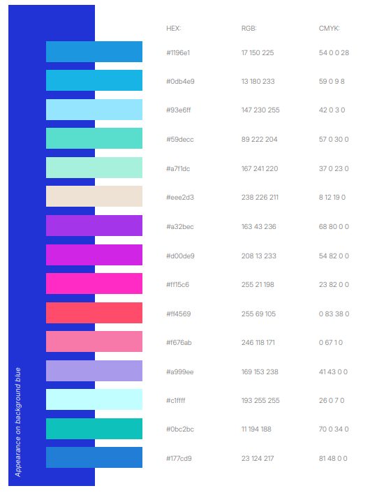
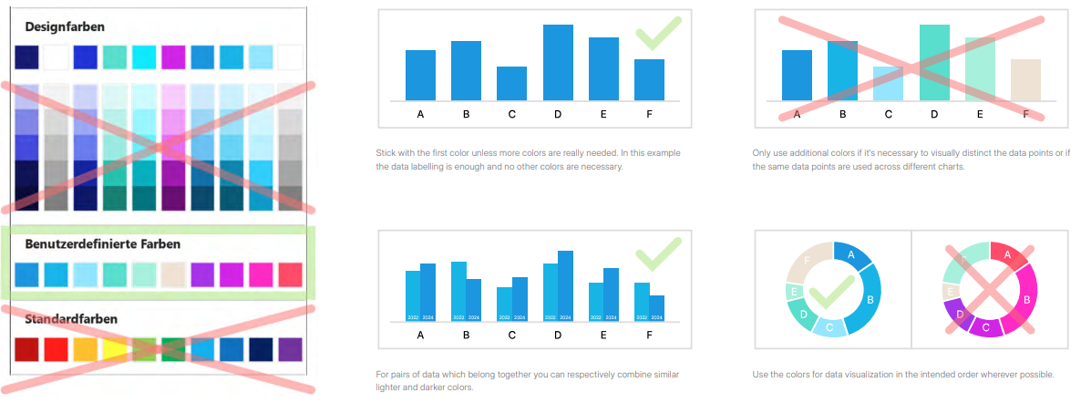
Color palette for charts and infographics
Can be used on both white and background blue
Secondary color scheme for data visualizations (e.g. charts, diagrams and infographics) in SNP software and presentations
Color usage examples for charts and infographics
Visual expamples of the color scheme for data visualizations (e.g. charts, diagrams and infographics) in SNP software and presentations
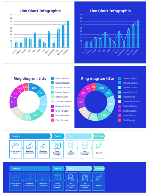
Charts and infographics
Do’s & Don’ts
House font
Fonts play an important role for SNP’s image: They convey information to our target audiences – our “readers.”
To catch their attention, use the font “Archia Semibold” for headlines and important teasers, subheadings and quotations. Use the font “Inter Display Light” for running text. Use the font “Inter Display Semi Bold” to emphasize parts of running text. Only use this font in exceptional cases.
If these rules are implemented well and adhered to, our brand will have a high-quality overall appearance across all media.
ABCDEFGHIJKLMNOPQRSTUVWXYZ
abcdefghijklmnopqrstuvwxyz
!“012346789#$%&‘^_`*+,-./:;<=>?@{|}()[\]~§«©®
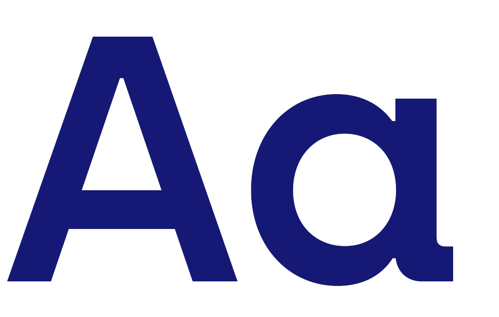
“Archia Semibold” is our headline font. It is striking, technical-looking and easy to read, quickly recognizable, brand-defining, and particularly suitable for emphasis or introductory texts.
"This is a quotation. This is a quotation. This is a quotation.”
“Archia Semibold” is used for quotations.
ABCDEFGHIJKLMNOPQRSTUVWXYZ
abcdefghijklmnopqrstuvwxyz
!“012346789#$%&‘^_`*+,-./:;<=>?@{|}()[\]~§«©®
The Archia Semibold comes as a headline above the text
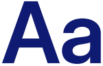
Use the font “Inter Display Semi Bold” to emphasize text or make it particularly distinctive, especially running text. To avoid overuse, only use it in exceptional cases.
ABCDEFGHIJKLMNOPQRSTUVWXYZ
abcdefghijklmnopqrstuvwxyz
!“012346789#$%&‘^_`*+,-./:;<=>?@{|}()[\]~§«©®
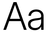
“Inter Display Light” is mainly used in running text. Combined with the headline font, the result is an elegant, visually appealing mix of fonts.
Headings
For headings, always use the font ”Archia Semibold” and the color
Stratos Blue. If the heading appears on a blue background, use white for the text. Headings must always be at least two points larger
than running text.
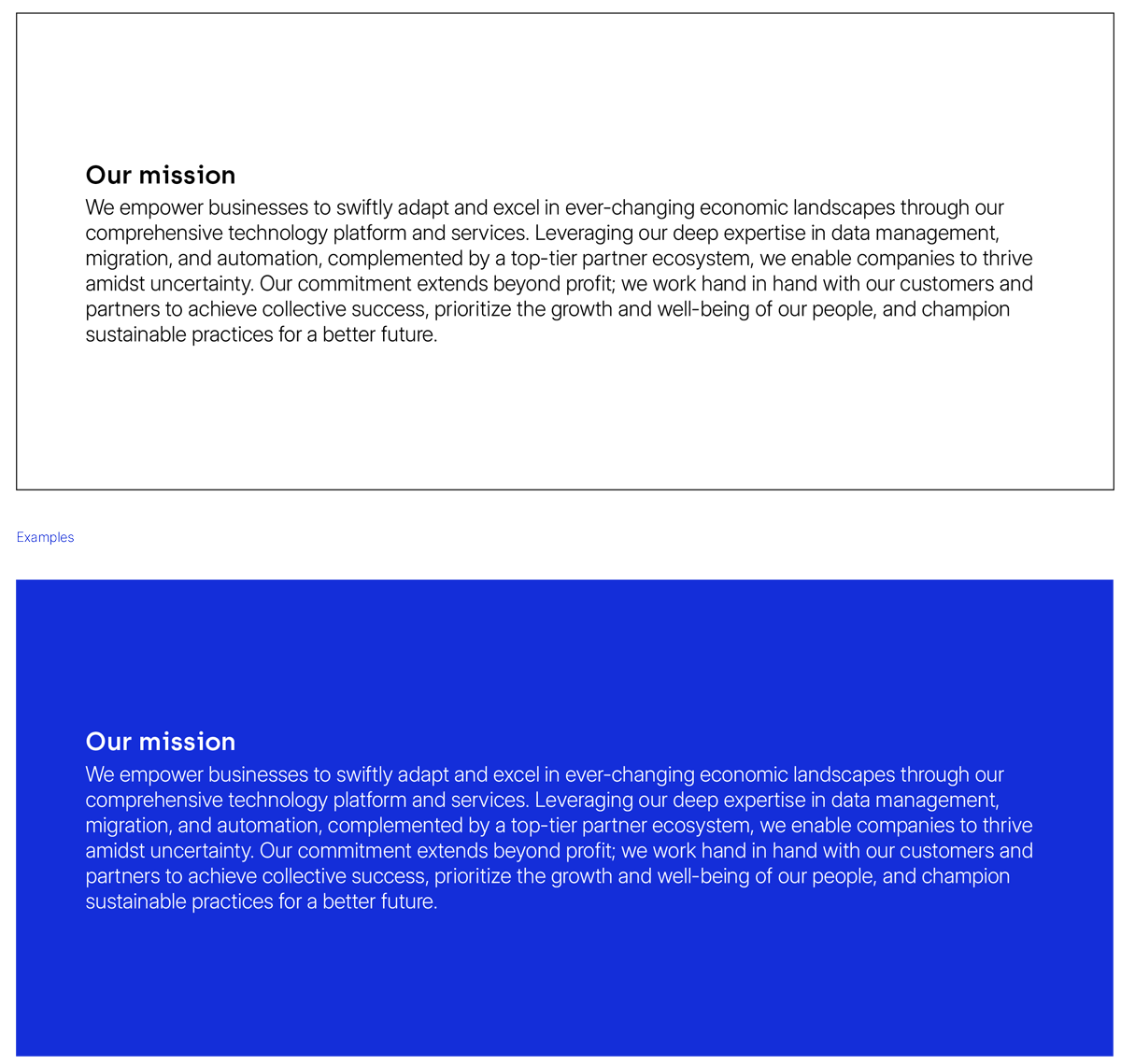
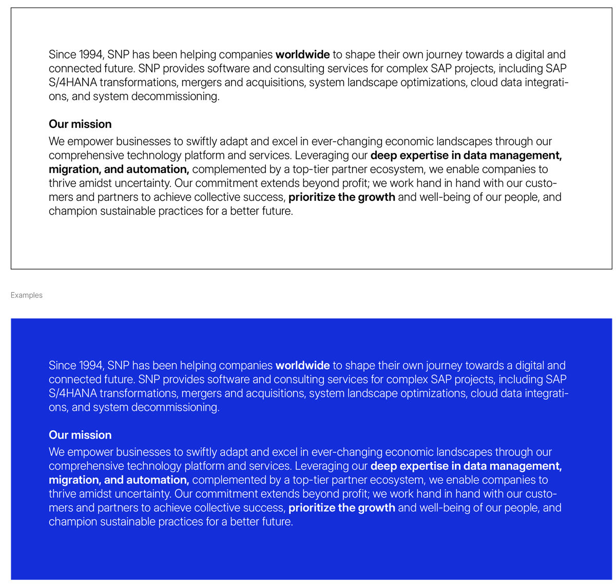
Running text
For running text, always use the font “Inter Display Light” and the
color black. If the text appears on a blue background, use white for
the text. Running text must always be at least two points smaller
than the heading. Use the font style “Inter Display Semi Bold” for
subheadings and emphasis in running text.
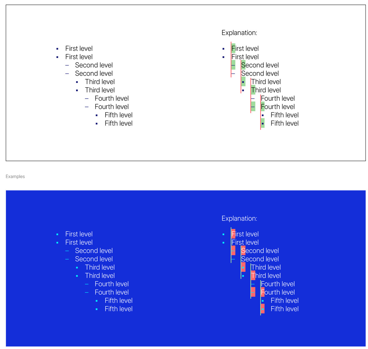
Bullet points
Squares and dashes are used alternately as bullet points. Always
start with the square. Each new list level begins at the start of the
sentence of the previous level. The bullet points are displayed in
”Stratos Blue”. If the text appears on a blue background, the bullet
points must be colored in ”Sparky Blue”.
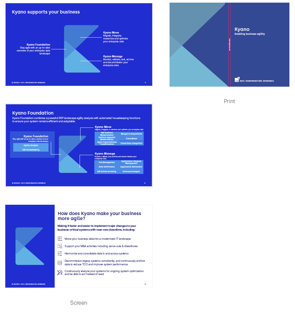
Kyano Logo
The Kyano logo should primarily be displayed
on a solid blue background (Background Blue).
If not otherwise possible, it may also be shown
on a white background.
Kyano logo colors
RGB: 23 124 216
CMYK: 57 10 0 31
Pantone: 2170 C
RGB: 17 150 225
CMYK: 54 0 0 28
Pantone: 2915 C
RGB: 13 180 233
CMYK: 59 0 9 8
Pantone: Blue 0821 C
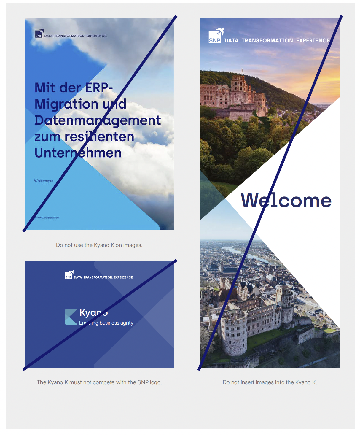
Kyano K
The Kyano K must only be used when referring to the Kyano
platform and when its use makes sense. The Kyano K must not
compete with the SNP logo. When using the Kyano K, no additional
triangles should be used. Do not use the Kyano K on images and do
not insert images into the Kyano K.

Kyano K do’s & don’ts
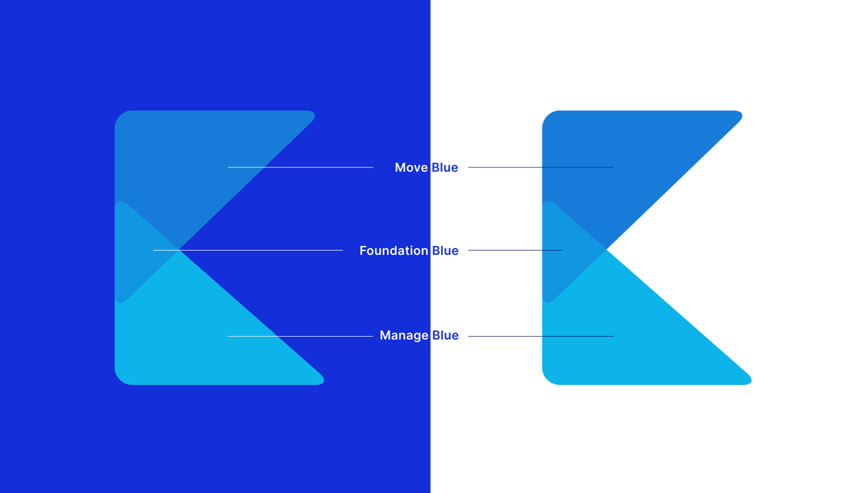
Kyano Triangles
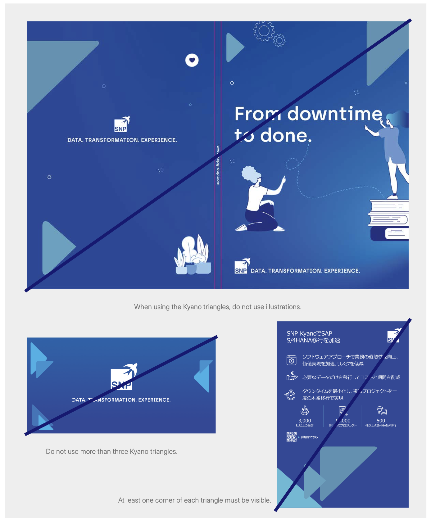
The Kyano triangles must always be used in sets of three. When placing the triangles in the bleed area, at least one corner of each triangle must be visible. The triangle for Foundation should be smaller than the triangles for Move and Manage. The triangles can be rotated and mirrored, but not distorted. Do not insert images into the triangles. When using the triangles, do not use additional images, illustrations or the Kyano K on the same page or slide for print and powerpoints.
Fixed constellations of the three triangles are available in RGB and CMYK. The files can be mirrored, but not rotated or distorted. The fifth constellation must only be placed in corners at the top. The sixth variant is used exclusively for outlining the page number.
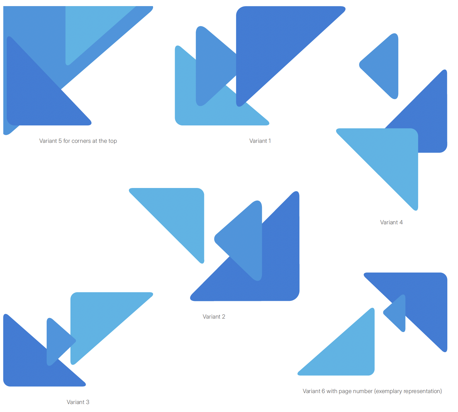
Kyano Triangles do’s & don’ts
Clear, committed and optimistic
Alongside our visuals, our tone of voice and language choice also
defines us as a company. We aim to express ourselves clearly with
the ultimate aim of being easily understood. We work together with
our customers and partners, and our tone of voice conveys this by
focusing on our experience and solutions.


Visual imagery
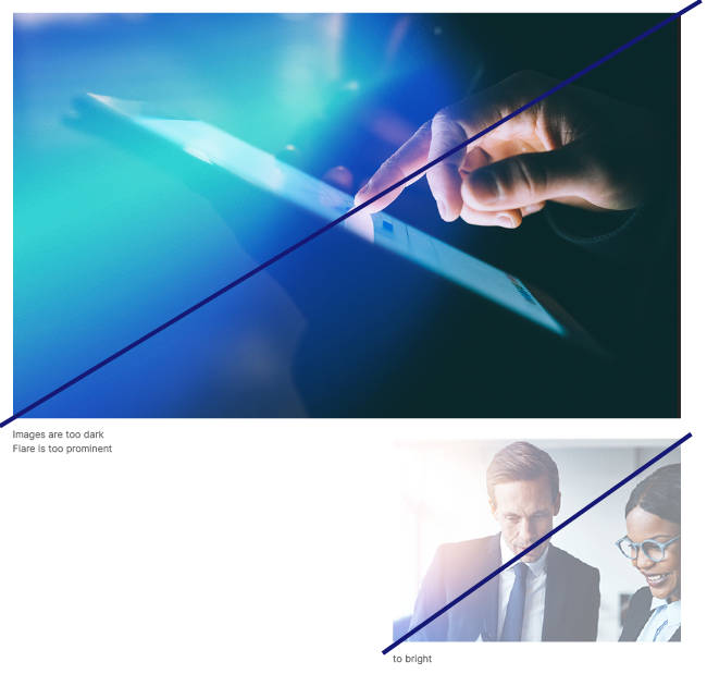
Bright, friendly and at the heart of the action: In our images, we ensure
that the depth of focus is natural and the image has a clear foreground
and background. We move freely between finer details and the big
picture while keeping our images bright and friendly. Just like us
Don’ts
A picture is worth a thousand words. Unless it’s the wrong one. And to ensure that we speak the same visual language worldwide, we take care not to use images that are too dark – otherwise the flare becomes too dominant.
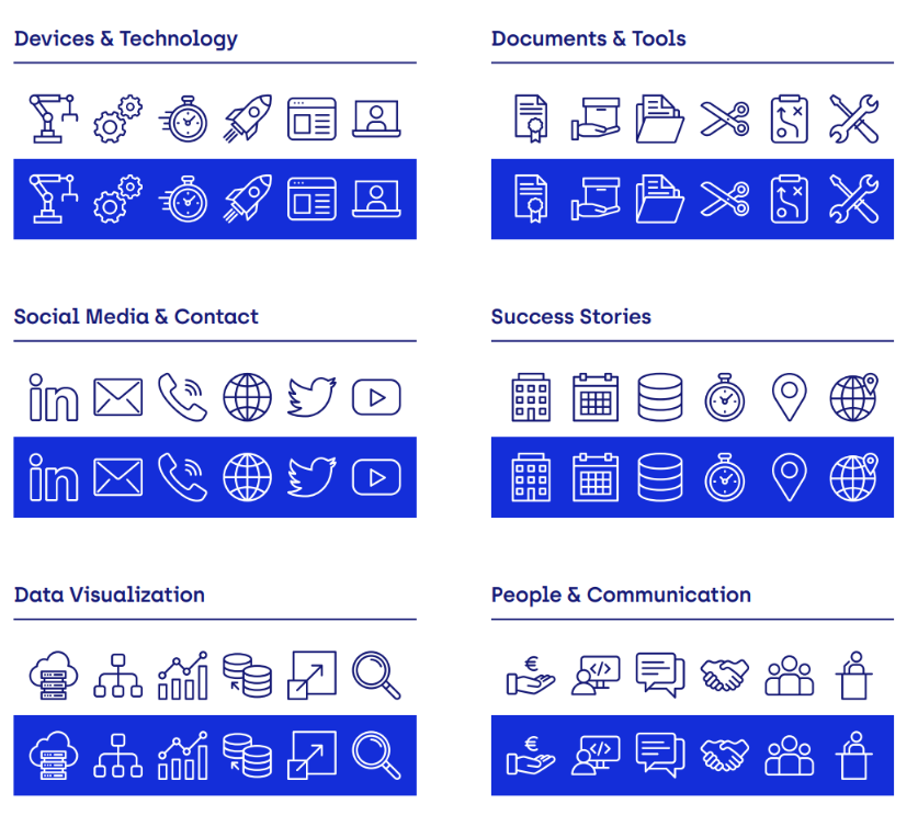
Icons
To put it simply: Sometimes, neither worlds nor illustrations can put exactly what you want to say into words. For example, there simply might not be enough space for them. Or you can simply say more with less. For such cases, we have developed a set of icons.
This is only an excerpt. The complete icon set can be obtained from the following link:
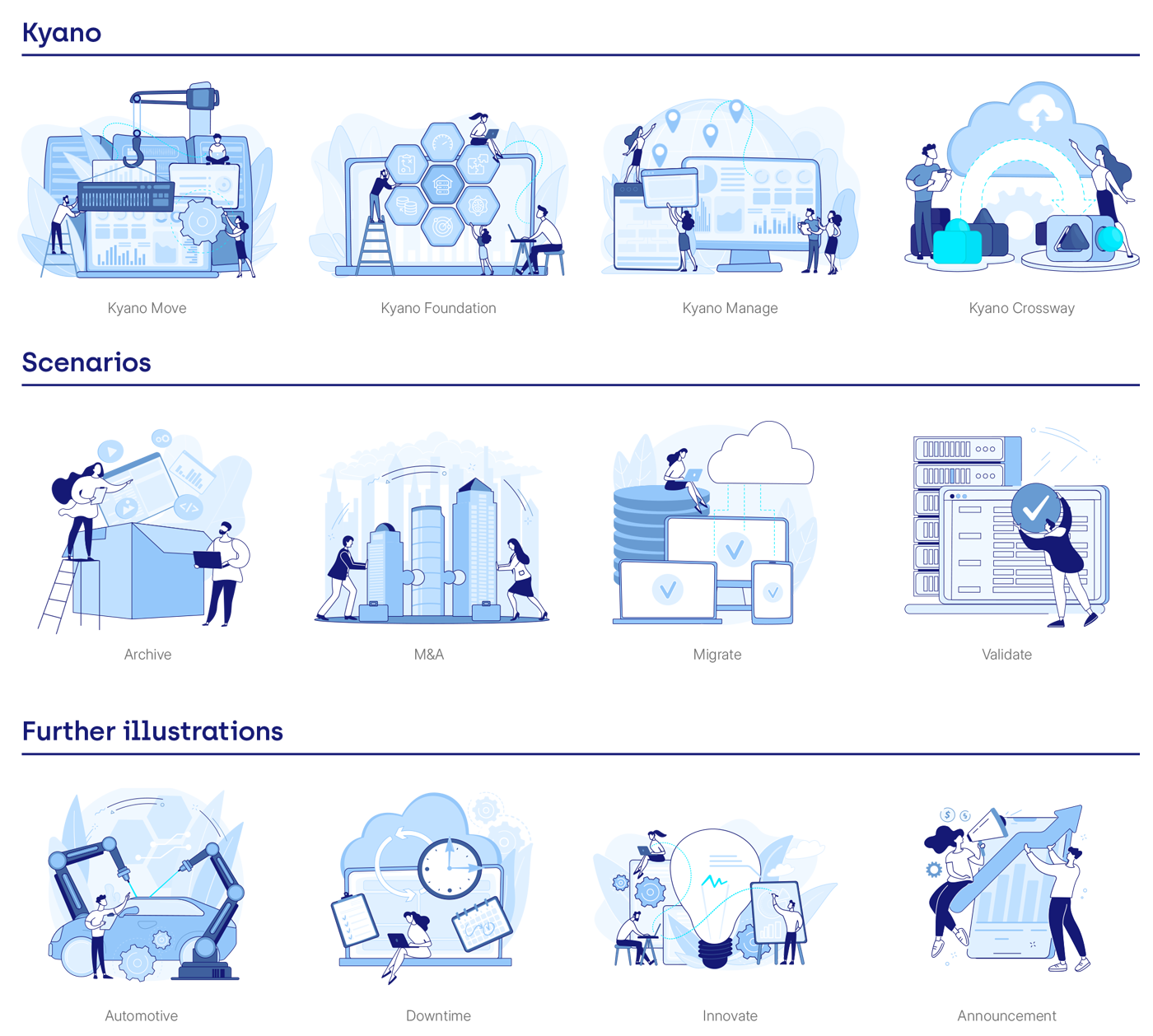
Illustration: Two-dimensional
Sometimes it doesn’t take an entire world to explain what we do. In such cases, we can apply our illustrations in our color palette as a 2D image. The bottom line is that we always have the right graphic at hand.
The illustrations must not be placed over images. When using the illustrations, do not use other images, the Kyano triangles or the Kyano K.
This is only an excerpt. The complete illustration set can be obtained from the following link:
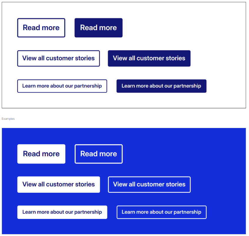
Buttons
Buttons must have rounded corners. The rounding value is three
pixels. The button can be scaled, but the rounding value must
remain unchanged. Buttons should only be used if they are
clickable, such as on our website or in LinkedIn Ads.